

The commonly held belief is that distribution is not a sexy business. That it’s boring, and our days are filled with paper-pushing monotony. Cue the knee-slapping chortle from the distributors. You all know nothing could be farther from the truth.
This belief harms the distribution industry because – for one – it’s hard to attract top talent to a sector that’s mistakenly been labeled as dull.
We know the kinds of frenetic pressure, creative thinking, and various changes you go through as part of this $6 trillion industry. It’s time everyone did.
That’s part of the We Supply America logo origin story.
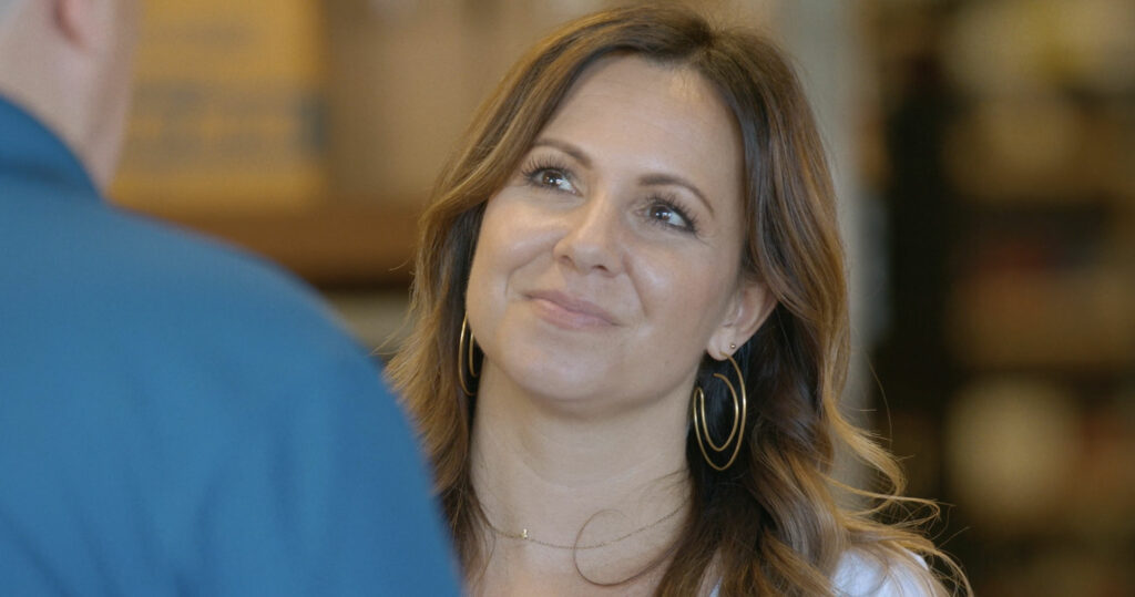
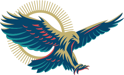
Our logo represents so much to us. The design builds off the opportunity that is America. The Eagle, the symbol of America, is bold, determined, proud, focused, and in motion—these are all the characteristics shared by those in distribution (and I’ll be telling those stories in the docuseries).
Have you noticed that some, when drenched in adversity, are miserable?
“Have you ever seen an Eagle in the pouring rain?” asked Bethany Hepler, VP of Design at UnleashWD. “It is fiercely beautiful. It is still a commanding presence that demands respect and is still precise, resourceful, and on the job, just like our distributors during this past year,” she said.
I wanted to play on this image because of the deep-seated meaning behind the Eagle and how directly that ties into the businesses we will feature. Strength, courage, wisdom, leadership, vision… all characteristics of the incredible men and women in distribution. The Eagle is classic yet modern. Rather than sitting, our Eagle is in motion, progressing forward, about to make a grand move, a little bit intimidating, similar to how your businesses operating today.
The sun has a meaning as well; it represents the go-go nature of the distribution industry as well—that working sun up to sun down isn’t unusual for you small, independent, entrepreneurial businesses and your leaders. Every day you give everything you have to your business on behalf of your families, your employees, and your communities.
The overall color scheme of an American red, white and blue was modernized so that it wouldn’t be dismissed as just another political message but more of a question mark – what is that?
Finally, the red banner with our slogan – Championing the Noble Calling of Distribution – is being carried forth across America by the magnificent Eagle.
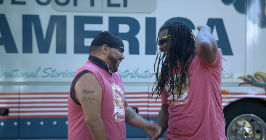
As part of my commitment to telling the inspiring stories of independent distributors across this nation, I wanted the RV to command attention, too – making people look twice and say, “what just drove by me? What was that RV with the awesome Eagle swooping across it about?” It was designed to make people question what they just saw— inspire them to find out more and watch the docuseries to find out about the people that dedicate their lives to supplying America. And if I can make a few people smile along the way – fantastic.
The Eagle also means something else. It means goodness, honesty, and strength. As I travel this land, meeting distributors, employees, and families, one of the many attributes that they all share is innate goodness that translates beyond their immediate family and friends to the employees, the community, and the country.
You’ve been struggling during these last few years with disruptive market forces and digital transformation. During this past year, you’ve been hurting—strained, stressed, and bordering on burnout.
I hope when you see our RV rolling by, you’ll remember why we are doing this. This is not a campaign; it is a calling. We believe down to our core that:
- The channel needs champions to put a voice to the noble calling of distribution
- The 6 million professionals throughout distribution need a coach and cheerleader to inspire their personal and professional growth
- The 30,000 distributors throughout America need a catalyst for accelerated change, transformation, and innovation—with digital transformation at the top of this list
- We believe that we are in a position to champion, coach, cheerlead, and catalyze and that We Supply America is a bold move to begin the process
- We Supply America is the right thing to do, right now
- And oh yea … we like to break the rules
- This will be fun, thinking differently and breaking a few rules with you in service of the businesses and individuals we serve.
Are you part of the distribution industry? I want to hear from you.
Text MEETUP to 1 (847) 744-8570.